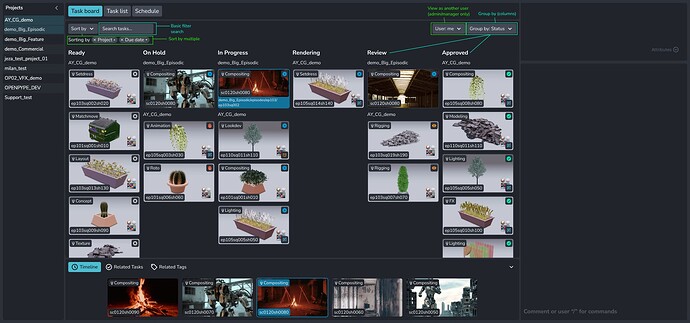
This is the latest design prototype we have for the kanban and the related tasks panel.
The idea is that you can quickly compare your task to other “related” tasks. In the future this might become a more robust comparison tool but for now we are keeping it quick and simple.
We decided to go with card design v3 but with some tweaks, like hiding the path and only showing on hover. We will have to see if this is annoying that you can’t see the the project name at all times.
Top right of the task card is the status but bottom right there is space for a “notification” icon. This could be a warning about an upcoming due date or that a new note has been made. This probably won’t be featured in the initial release as notifications is a whole new ball game, it’s more of a concept.
Lastly I wanted to know what filtering and sorting features would be useful for everyone?
[edit: originally only one project was selected, this was an error and now two are selected]
- Search filter: would being able to search the kanban be useful?
- Sort by: you can get really custom with your filtering, like filtering by multiple types. Is filtering per column necessary?
- Select User: a bit of an out there idea, viewing the board as a different user? (admin/manager only)
- Group by: by default the columns are sorted by status but maybe it would be useful to have project or task columns.
