There’s already quite a robust tagging and linking system that can be used for that. The idea being that you can make a hero shot link type for example and relate things together that way. Millions of various uses probably there
Further to @milan point, I think that was also the idea for the related panel. I could definitely see these sort of links showing up here and being able to quickly compare your latest publish to a “hero/look dev”.
Overall the feedback on the layout has been good, so we are confident in nailing down some of the finer details.
We will be sharing more designs as we go on.
The task card on the kanban is going to be an extremely important element on the dashboard and we want to absolutely nail it. Here are 3 different (wip) versions and we would love to know what you think!
Please vote for your favourite and leave anymore feedback below.
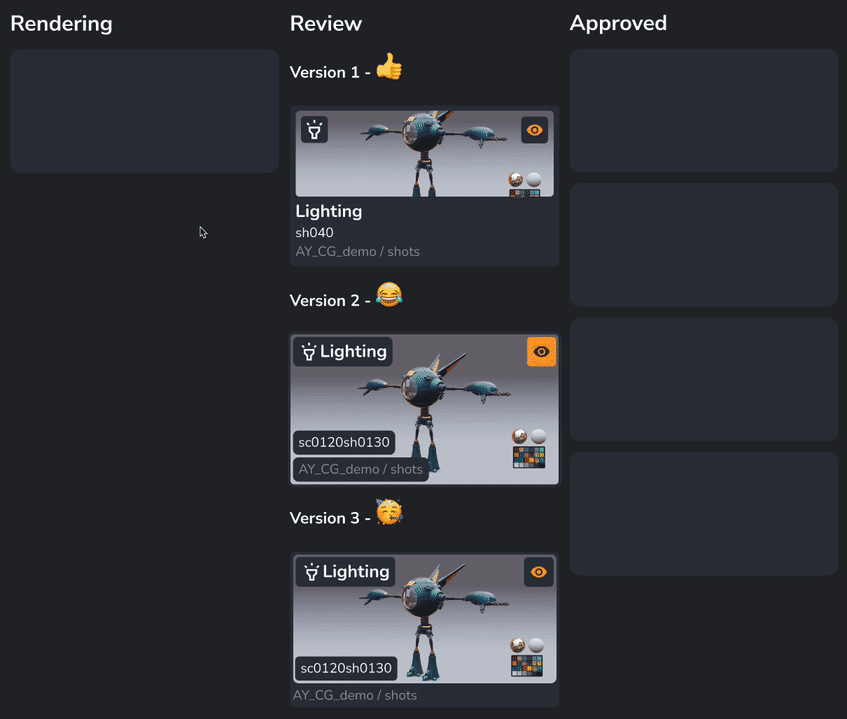
- Version 1

- Version 2

- Version 3

0 voters
I really like version 2 but I’m quite worried how that’d look with longer hierarchy names and maybe even longer shot names - especially because it seems to include the project name too I have a feeling that it might grow long pretty quickly.
Also @Innders to really get a feeling of how this works overall I think it’s best if you could preview each of the designs in such a way that they are repeated in design but with a different text + image instead of the 3 designs together. Mostly because it’s hard to feel whether it’ll end up feeling very cluttered if you have the big images of e.g. version 2 everywhere - which if you have long lists of entries then maybe version 1 might become much clearer. I believe version 1 feels relatively close to how Trello looks with images and I suspect they might’ve had a reason to design it like that.
These are very good points.
Version 1 was always the safe design as it’s tried and tested in other applications (like Trello).
I think v2 and v3 are trying to push the boat out more. The idea was that artists (at least from our experience) rely heavy on thumbnail images to quickly find tasks and so those designs maximise thumbnail size.
I really like your point on clutter and seeing if having 20 or 100 of theses cards on the page is just too much.
More to come…
This is awesome but I think that version 1 would be much more tempting if the thumbnail wouldn’t be cropped. With the given examples 2 and 3 make you feel that they are the best ones as there’s no hiding of data but that would greatly vary depending on what’s represented on the thumbnail and the names of the show/season/sequence/shot…
Having said that… I think 3 is the best mix of both worlds ![]()
This is the latest design prototype we have for the kanban and the related tasks panel.
The idea is that you can quickly compare your task to other “related” tasks. In the future this might become a more robust comparison tool but for now we are keeping it quick and simple.
We decided to go with card design v3 but with some tweaks, like hiding the path and only showing on hover. We will have to see if this is annoying that you can’t see the the project name at all times.
Top right of the task card is the status but bottom right there is space for a “notification” icon. This could be a warning about an upcoming due date or that a new note has been made. This probably won’t be featured in the initial release as notifications is a whole new ball game, it’s more of a concept.
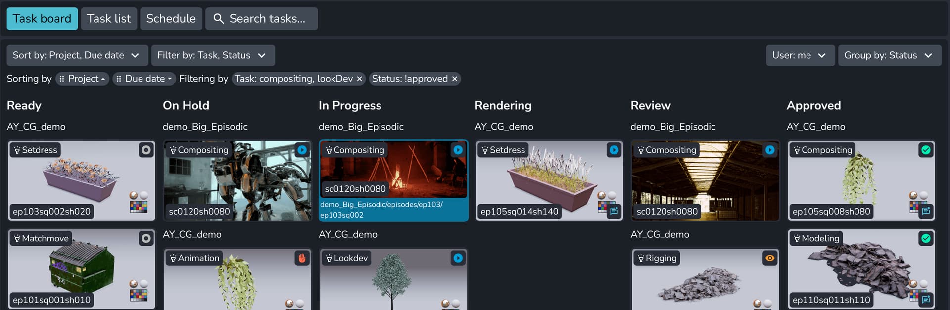
Lastly I wanted to know what filtering and sorting features would be useful for everyone?
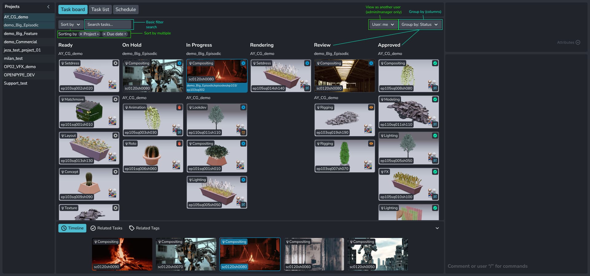
[edit: originally only one project was selected, this was an error and now two are selected]
- Search filter: would being able to search the kanban be useful?
- Sort by: you can get really custom with your filtering, like filtering by multiple types. Is filtering per column necessary?
- Select User: a bit of an out there idea, viewing the board as a different user? (admin/manager only)
- Group by: by default the columns are sorted by status but maybe it would be useful to have project or task columns.
Note that when sorting by multiple that the Sorting order becomes important too so that the UI should at least allow re-ordering the sorts too. I wonder how crucial the sorting by more than one category becomes if you are already “grouping” separately from that too? Anyway, still it’s a nice feature of course.
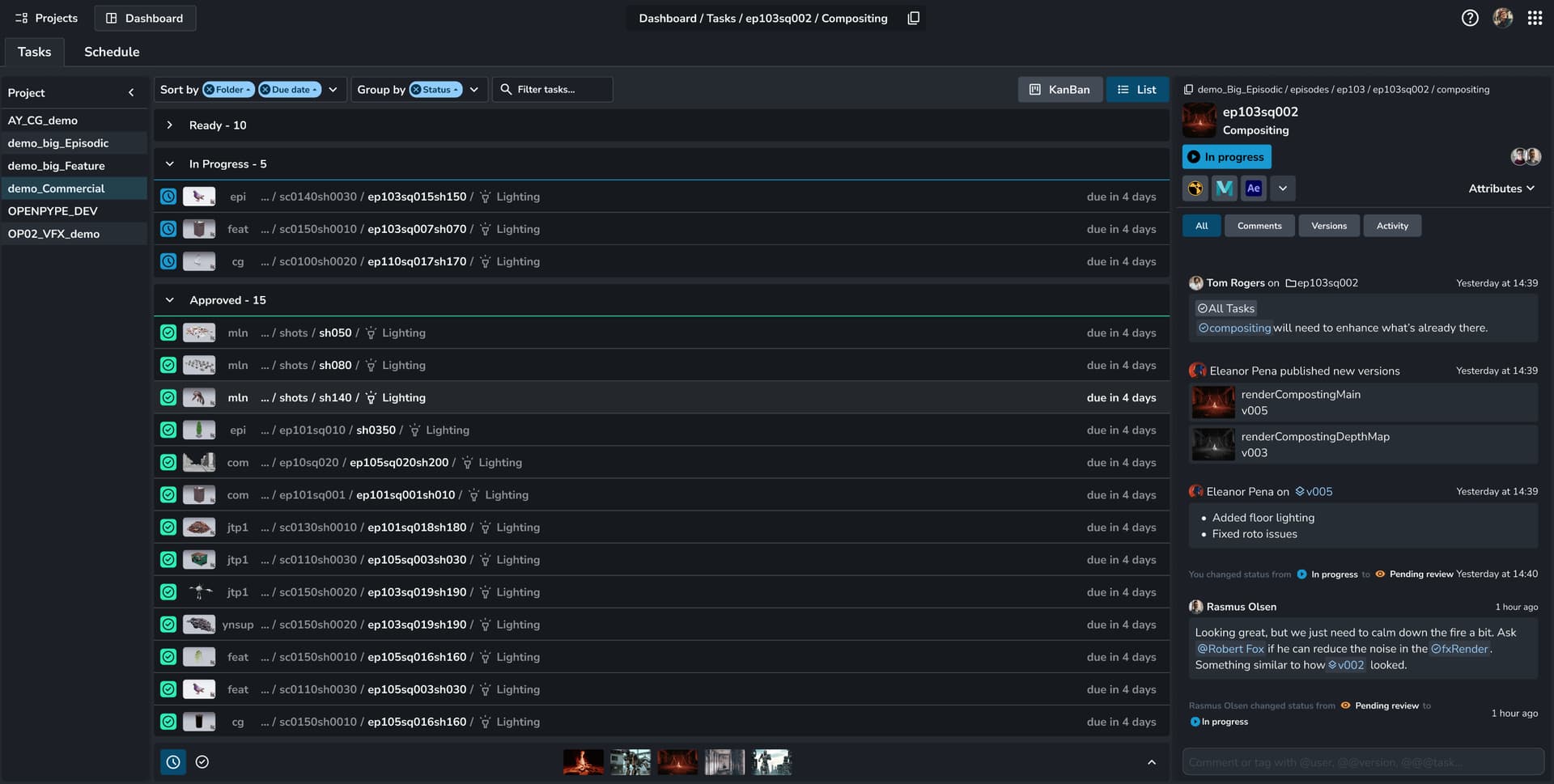
The screenshot looks a bit as if it’s grouped by both Status (columns) and Project (headers in the columns) too due to the headers in between the thumbnails. It’s nicely distinctive, but how does that work if you would not sort by Projects? Would you then just randomly get headers as soon as something is related to another project than the one above?
Also, I find that the screenshot looks confusing since it shows “Projects” left side, has a single project highlighted but still the Kanban board shows multiple project. As such the question rises, how do I filter to a specific Project?
Other filtering I think might be interesting/useful:
- Filter to task type, e.g. show me all my compositing tasks only
- Filter to certain statuses - e.g. ignore all that are approved.
- Filter to due dates, only show me those that are due in the next two weeks or those that are overdue but not approved yet.
Yes - I think so.
Good question. I’m not sure if I’d ever apply a different filter per column, likely it’d always be a global filter for the full kanban board.
I think for manager that’s definitely nice. Might even be nice to select two users to get a feeling how busy both are so you could maybe shift over tasks to another person to even things out?
Being able to group by Task name or type could be nice in some cases. But most frequently I’ve just seen the status grouping kanban board and then rarely see that change. So looking forward to the use cases of others!
+1 for searching! If this could be some wild card searching on different properties related to the task, then we wouldnt need a filtering menu. For example user wants to filter to just lighting tasks.
-1. Personally dont think there would be a need for this.
+1. This has come up a couple of times in production where a supervisor wants to see what tasks an artist is assigned to.
For an artist dashboard I think status makes sense. Maybe project/task columns would be useful for managers?
Just wanted to add an idea - what if you could also filter by anything that had it’s status changed recently or had new comments? E.g. show me only the new tasks or tasks with new comments that are assigned to me. Not entirely sure how that would work implementation-wise.
But maybe I’m mixing too much of an activity feed in here now. ![]()
Just to quickly clarify, this was an error and it has been fixed in the design now.
I can see this being super useful but you are right it would fit more into the activity (that we are planning to have). It would be nicely integrated so clicking on that “new task” would select and highlight the task for you.
Thank you @tokestuartjepsen and @BigRoy for the feedback!
Not all of these features might make it to the final release as we have limited resources but it’s good to know what features might convince a studio to use (or at least try) our dashboard over a competitors.
Sometimes it’s just one really useful tool that is a game changer.
[edit: added filter by button and sort by ordering control]
Hey! This is looking very cool!
I’m not sure if this is the right point for this, but one thing that would be great is a Marking Menu/ right click menu on tasks - FT has an ‘action’ button on each task, but it would be cool to have a menu to jump straight to a tab, or display info, or hover over for comments. Maybe a customisable part i.e. jump to episode view, jump to explorer folder (Similar to P4 this would be super handy), jump to lighting task etc.
Hey @leondexter thanks for posting, great to see you here ![]()
We plan on having a robust right clicking (technical term is context menu) system for the whole of the website.
There are already a lot of areas you can perform actions using a context menu and the Artist Dashboard task will also have right clicking to perform actions.
Some menu items I can think of (including your suggested ones) could be:
Open in browserthis would also open it’s folder.Editopen the task in the editor
Open in Mayashow last performed actionComparewhen two tasks are selected, open the comparison panelView latest versionopens a viewer to see the most recent published versionFilter by→ (sub menu)task type: Compositing/status: pending changes.
Definitelly not needed. I’d say that almost anything that is done per column becomes too much of a hassle, so that very few people will use it.
I’d stay away from that as too. Simpler a faster is better than more complex and slower to learn all the features.
I actually feel that the status icon is not needed in here, considering we’re already in a status column. It’s really valuable to see it on the cards in the browser for instance, but here, it’s double information, cluttering space that could be used differently.
I think this depends on how the columns are configured. If they are set in the settings by an admin; a column, although grouped by status, can have multiple different statuses in the same column.
Column Ready could have ready to start and pending changes. Quickly knowing the difference between the two is vital imho.
But maybe we start with “true” grouping by status, where every column has only one status. In that case the icon would be duplicate info and could be removed or moved to the top of the column.
Only issue are columns like “rendering”" that often have multiple statuses like “waiting” “rendering” “failed” “done”. But I’ve always felt like this was a bit of a hack anyway.
Eh, you’re right of course. I completely forgot about that and it is indeed quite crucial. I’m pretty sure we even discussed it before, so yeah, let’s keep it
This feature is really coming along, looks awesome and fixes one of the major issues I have with ShotGrid which is it not having a graphical-first view for artists.
I have a request which I hope is small, is there any way to ensure that this would work with ShotGrid URL pages? I believe ftrack has a similar feature.
The idea being that we could embed this right into SG so artists wouldn’t leave SG and essentially just view this as an iframe.
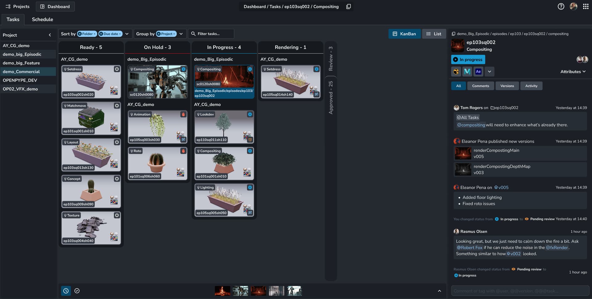
Hey! Just curious to know, can the published renders/review videos can be also played through the web dashboard? or any application links to it like mrv2 or DJV?
And my Team can’t wait for the Activity tab ![]() !!!
!!!