So I’ve been working across different hosts to implement the New Publisher in the integration. I’ve fiddled some with the new publisher in Houdini and did some work in:
- Fusion New Publisher #3892
- Maya New Publisher #4388
- Substance Painter Integration #4283
These are all working with the new publisher system.
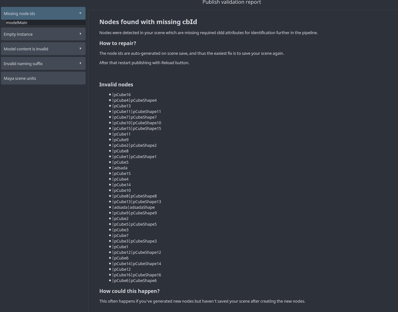
Based on that development time spent + the UX of testing the publisher itself I wanted to raise a discussion about the “Publish validation report” and the way it’s structured. To me personally it’s a big bloat and I’d argue that for many cases it’s even harder than before to quickly read up on what actually is wrong with the scene.
Examples
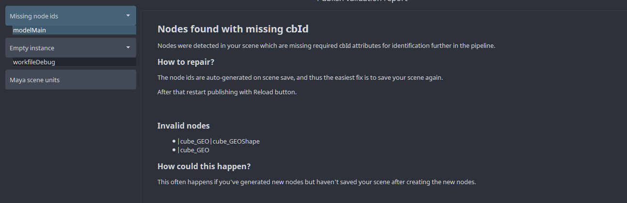
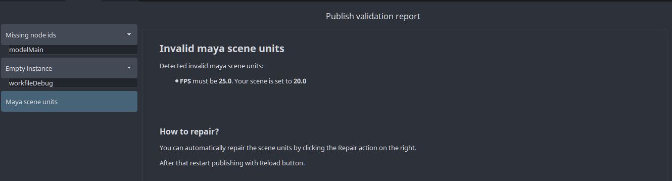
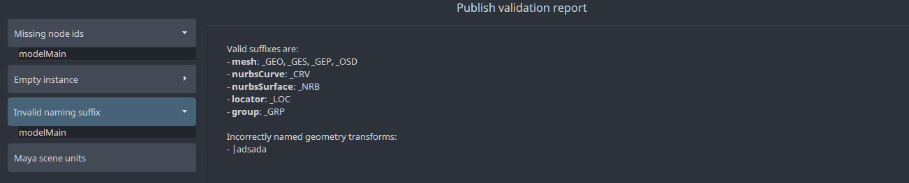
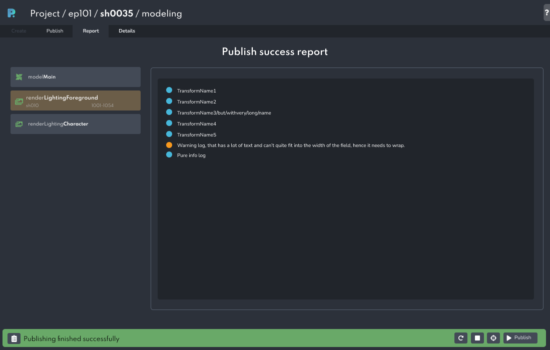
Here are some examples:
What these do nicely is ‘explain’ to the user what is being validated however I’d argue that if a user publishes 10 models a day and they’ve worked with this system for a few weeks they don’t care about any length explanation - they care about the content that is invalid and especially rapidly seeing all that is wrong + repairing/selecting the invalid content as fast as possible.
Amount of extra code
Even worse maybe I think is the amount of code involved to ‘report’ it as verbose as these screenshots. For example take this commit to rewrite the Maya unit validation in such a way that it generates this new report:
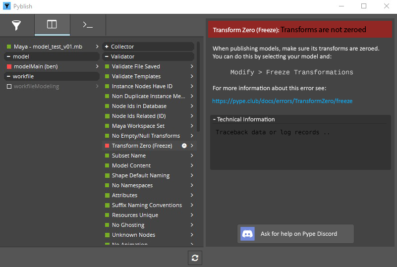
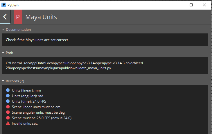
The old code would have generated this report:
To me the old structure albeit slightly more technical looking directs me much better as to where I should be looking. I’d even argue that if those old log messages were slightly more verbose in their wording that they’d appear quite a bit less technical.
Extra problematic now is that we’ll need to spend much time in generating a report that looks good in this UI but also spend the same amount of time getting structured output which provides the exact same information in a log for e.g. for command line publishing or deadline rendering.
Old reporting from code more pythonic
The old plug-in code somewhat forced a plug-ins’ source code to itself be a bit documented. Since the docstring would be what is shown at the top as documentation. To me that’s a plus. When I look at the plug-in in code I can read up what it’s about and there’s much more chance developers keep the information in sync with what the plug-in does. And even then they did not!
The same goes for the error logging. The new system requires to spend coding time to ‘format lists of data’ into bullet points of node names. Again, see the commit I mentioned earlier. Maybe it’s just that I have less experience with the new system but I have a hard feeling that it’d be easier to write the new code than the old - even though we should have a huge focus on making the development as logic and simple as possible so that it’s very easy to generate a great report and output to the end user without getting in the way of writing small plug-ins.
Lack of ‘default layout’
A big issue with the new reports is that they lack structure. The report can have any amount of headers, any amount of hints, etc and there doesn’t appear to be any best practices.
I think personally to me the clarity of the old publisher UI helped a lot. There’s documentation, there’s a specific log with more details.
I’d actually argue that the new publisher should mimic that. Each Report should just have a “Plugin documentation” area, a “Report” of the actual issue and a “Log” of the output.
Currently each report I check out for something that got invalidated has me looking around across walls of text to find the actual information I need. It needs more consistency and I’d argue more explicit sections. Having a clear ‘report’ versus ‘documentation’ structure I think personally would help a lot.
Other notes
I wanted to also copy-paste this rant I posted elsewhere during a moment of frustration:
Admittedly I’m close to a point where I’d rather go back to the old publishing system. In my test runs of creating and publishing I was able to go through the old publishing workflow quicker, with clearer visual feedback on what was actually getting processed from my scene (and also what actually finished!) and if an error occurred I honestly believe the old way was much better. Yes, for newcomers it’s nice to get a thorough documentation and report about a certain validation that failed… But if you are publishing 15 models a day you really don’t care about a lengthy explanation of the normals being invalid. You care about seeing which instance, which model, select it rapidly and fixing it. And if a validation didn’t pass that I haven’t seen before then and only then I would care about getting a lengthy report on how to solve this issue. The new system feels like it might help someone who publishes a few models in a system they are new to but it’ll just be much of a slowdown to anyone who has worked with the system for years.
Just selecting the invalid nodes for five failed validations individually took me 40 seconds with the new system on four instances. With the old it took me about 6 seconds (with the potential downside that I couldn’t filter the selection per instance but in practice I didn’t really care too much. If it didn’t pass a UV validation I just quickly want to see which meshes didn’t pass - not necessarily which meshes per which instance)
I think there are features the new system brings are very welcome, like managing creators and the settings too. The still lacking stability of the UI is something still forgivable too but the UX of the actual publishing itself to me is actually a step back.
Also wanted to note that most creators can work with your selection “Use selection” and add the currently selected nodes or things into the instance but the Publisher UI being this massive I often find myself spending a lot of time moving the UI to the corner of my screen, scaling it down, checking my scene selection, scaling/moving the UI back and the clicking create. It feels like the UI is about 75% of my screen space by default, I even have the tendency to make the window even bigger to visually parse what all the data tells me on the pages because everything is super big. The old create UI was so small that it didn’t have this issue.
With that it appears the new system appears to be designed from the ground up with a heavy focus on “ensuring no one needs to explain ever to a user how the publishing failure works” so that potentially less newcomers will ask questions about Hey, thing is red during publish - what’s up? and with that there’s been close to no focus on making sure that once those questions were answered that these same artists can go through publishing report rapidly, find the relevant data and continue to publish 15 models a day.
Yes, clear instructions and documentations on WHAT was validated and HOW that could be repaired are very nice - but once you’ve had a Missing UVs error twice all you want next time is just directly click a thing and see which nodes in your scene are missing UVs. Previously I could right click Select and voila, I had them all. Now I need to go into the report (all the way on the left) then move cursor all the way to the right to click on the select action. Imagine this for five validations going wrong on five instances - I have to do this 25 times. Previously I could’ve done this five times rapidly within a few seconds and quickly get to investigating my actual scene.
Discussion
A large part of the issues with the older publisher which I suppose was considered too ‘technical’ could have been solved e.g. by already Hiding all plug-ins which passed so that the user would only visually still see by default “what went wrong” - that to me would’ve been a better version of what “report” is now already.
Then the next step would’ve been making it clearer that the failed things actually provide actions and information. Honestly I’m perfectly fine that this might have been a “one time learning” ordeal for new user, like “press the right triangle for more documentation/information” and if it shows the “A” icon you can right click for special actions.
I feel like there should be more structure to the new publisher so that it’s clear, for a report, where the user should look for what information. It should be quick and easy to get to see verbose logs for that issue at hand if they wanted sure.
I’m very worried validators will turn to be huge plug-ins, each with an xml file even and spending a lot of writing (+ computational time) on formatting some data into a report that’s marginally better likely for new users and probably overly verbose for existing users.







 Let’s do it.